
The Ultimate Guide to Designing Your Biolink Platform Page
Designing for Intent
Design isn't just how a page looks; it's how it functions. A poorly designed page causes friction, confuses users, and increases bounce rates. When you only have one link in your social media bio, the page it points to needs to work flawlessly as a router for your entire digital existence. But functional doesn't have to mean boring. You can create a page that is both highly effective and visually stunning.
Whether you are a musician pushing a new album, a freelancer trying to book clients, or a brand selling physical products, the principles of good design remain the same. Let's break down how to design a bio-link page that stands out from the sea of basic templates.
1. Establishing Visual Hierarchy
Visual hierarchy is the order in which a user processes information on a page. You control this through size, color, contrast, and spacing. When someone lands on your page, what is the very first thing you want them to see? What is the second? The third?
Your name or logo should be clear at the top to establish trust and confirm they are in the right place, but your links should be the visual focal point. Don't make your profile picture so massive that it pushes the important links below the fold (the area of the screen visible without scrolling). Users shouldn't have to work to find your content.
2. Color Theory and Brand Consistency
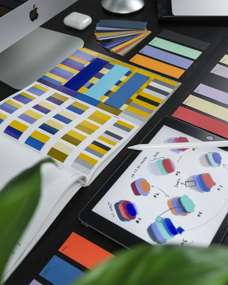
Your bio-link is an extension of your brand, and your colors should reflect that. However, readability must always come first. Using a neon pink background with white text might fit a specific aesthetic, but if users literally cannot read the buttons, the page is broken.
- High Contrast: Always ensure your text has high contrast against its button background. Use a contrast checker tool if you are unsure.
- Color Palettes: Stick to 2 or 3 primary colors. Use a neutral color (like white, gray, or black) for the main text, a primary brand color for the background or button borders, and an "accent" color specifically reserved for your most important call-to-action button to make it pop.
3. The Typography Matters
Fonts carry emotional weight. A heavy sans-serif font feels modern and bold, a delicate serif feels elegant and traditional, and a monospace font feels technical and edgy. Pick a font that matches your vibe.
Most bio-link tools integrate with Google Fonts. Our advice: stick to highly legible fonts for your buttons (like Inter, Roboto, or SF Pro). If you want to use a stylized, decorative font, reserve it only for your main header or name at the top of the page. Never use a hard-to-read script font for your actual links.
"Good design is obvious. Great design is transparent. Your users should focus on your content, not the interface housing it."
4. Emphasizing the Right Buttons
We see thousands of creators format their pages as a list of 15 identical buttons. This is a design flaw. You should visually distinguish between primary, secondary, and tertiary links.
For example, if you want users to buy your new course, that button should have a solid background color, an icon, and perhaps a subtle pulsing animation. Your secondary links (like your YouTube channel or Podcast) can be standard buttons. Your tertiary links (like an older piece of content or a secondary social account) can be styled as simple text links or ghost buttons (transparent background with a solid border).
5. Embracing "White Space"
White space (or negative space) is the empty area around elements on your page. It gives your design breathing room. Don't cram everything together. Proper spacing between your header, your bio text, and your buttons makes the page feel organized and premium. If a page feels cluttered, users will simply close the tab rather than try to hunt for what they need.
6. Using Backgrounds Strategically
A solid color background is safe and clean. A subtle gradient adds depth and modern flair. A background image or video can look incredible, but it carries high risk. If you use an image, make sure you apply a dark or light overlay (an opacity filter) so your buttons remain perfectly readable. Ensure background videos are compressed so they don't destroy your page load speed on cellular networks.
Design is an iterative process. Launch a clean, simple version of your page, look at your analytics after a week to see what users are interacting with, and tweak your hierarchy and styling based on the data.
Subscribe to our Newsletter
Get the latest insights, strategies, and growth hacks delivered directly to your inbox every week.
No spam. Unsubscribe at any time.